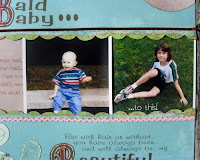
I love when I run across pictures and know that I have the perfect papers in my stash to go with them!
The papers and the 3-d flowers are from a page kit from Hot Off the Press. I also added a few bits "fussy cut" from Graphic 45 and K & Company.
I used a Martha Stewart punch around the page set (Cathedral Arches) for the rectangular frame and the corner punch from the same set to do the round frame and the page corners.
I've been having so much fun with the new Julie Nutting Paper Doll Mixed Media Stamps. They are so easy to work with and versatile as well! I used two different stamps for my girl on this layout...one for the head and hair and another for the body, to customize it to my layout. I am already getting addicted to these! I'm keeping my fingers crossed that Julie Nutting will come out with a line of boy stamps next!
These stamps have me going through all of my pictures of my little girl to see where else I can use them! Yep, I'm hooked!
Monday, August 12, 2013
Wednesday, May 15, 2013
Webster's Pages Citrus Squeeze
Webster's Pages has done it again....and just in time for summer! These papers are just bursting with the anticipation of lemonade, watermelon and summertime picnics and barbecues! The colors are fresh and fun and just begging to make their way onto my next layout!
Webster's Pages Plum Seed Collection
Well, Webster's has come out with another beautiful line! I absolutely love the colors in "Plum Seed" and can think of so many ways to use these papers. I can't wait to get my hands on these!
Tuesday, December 11, 2012
Fun Frames!
Here are a few samples of punched frames that I've been working on. These are so much fun and so easy to do! You can use edge punches, punch around the page sets, corner punches and chain punches. I especially like the one using an EK Success quilled flower punch. These punches are actually quite versatile and can be used for much more than simply making three dimensional flowers! I will be doing a class on these soon at Paper Wings, so keep an eye on their website and facebook page for the dates. The class should be on the schedule soon!
Monday, August 13, 2012
Time Goes By...
It's hard to believe that it has been almost a year since my last post. Time really flies by. Each day seems to melt into the next with the constant stream of appointments, work and trying to find time for everything.
Speaking of time, I have been going through some heritage photos that were recently sent to me by my sister. These pictures are truly family treasures. They are a link to our past and are a wonderful reminder of those that are no longer with us.
This paper, from the "A Ladies Diary" collection by Graphic 45, is the perfect background for my lovely sepia print photos. The images suit the time period when the shots of my grandparents were taken, as well. It's as if this line was tailor made for these photos.
I love how Graphic 45 makes it so easy to work with their paper lines. The papers almost show you where your photographs belong!
I created this layout as my most recent design team project for Paper Wings. I can't wait to come up with more projects for this beautiful collection. It's not going to be difficult. I have many more family heritage photos to choose from. I can also see this paper being used to create gorgeous wedding layouts and wonderful gift albums to share family history.
Monday, August 22, 2011
Getting "Punchy"
All of these flowers were made with paper punches...many with basic shapes like circles, squares and scallops, just used in different ways. There are also some made with border punches and corner punches. All of these flowers are simple to make and don't take very long to do. If you click on the images, you can view them larger to see more detail. I will be doing a class on making these flowers at Paper Wings very soon, so keep your eyes on the schedule. The class will also cover getting the most out of the punches you have. I will show you how to make a double border from a single border punch and how to make frames using border punches. I will also show you how to use corner punches in unexpected ways, including making circular frames. This class will happen shortly after the move to the new store space in Tuckerton. So, if you need a good excuse to come see the new store, sign up for the class! I'm sure it will be a lot of fun! I hope to see you there! Until then, enjoy what's left of the summer! www.paperwingsnj.com
Off to see the Wizard....
I can't believe that it's almost time for back to school...and all of the things that go with it. I'm just not ready for all of the back to school shopping and school and sports schedules. Make it stop!! I do LOVE the fall, though. Autumn is my favorite season and what better way to capture those fall memories than scrapbook pages. This is the right side of a layout that I just finished for www.paperwingsnj.com. The "Wizard of Oz" collection by Graphic 45 captures Baum's characters in all their glory...such a beautiful backdrop for my little "Dorothy."
Sunday, July 10, 2011
Good Day Sunshine
I am so fortunate that the girls at Paper Wings love the same kind of papers that I do! Every design team project turns out to be papers that I already have my eyes on! This line, Good Day Sunshine, by My Mind's Eye, is no exception.
The retro surfer theme was perfect for my photos of a day at the Jersey shore! I also love how the papers worked for these cute little baskets. I'll be doing a class on these soon, so keep your eyes on the schedule at the store! Part of the class will also be devoted to getting the most out of your punches. We'll be playing with border and corner punches in different ways as well as making flowers with various punched shapes.
Monday, May 23, 2011
Springtime...
This was a fun layout to do because I got to play with a lot of my toys...I mean, TOOLS. I had purchased a few punches & was anxious to test them out. I also bought a new Sew-Easy piercing tool, at Paper Wings, along with a little Tim Holtz tiny attacher. I also used a few older tools, as well. Colleen, at Paper Wings, thought that it sounded like a good idea for a challenge, so check it out at www.paperwingsnj.blogspot.com.
Thursday, April 21, 2011
Paper Wings Blog Candy
Fun little package to win from Paper Wings. Lots of great items
Good
Afternoon bloggers! I don't know about where you are, but here on LBI,
spring is in the air. It is beautiful. So beautiful in fact that I am
inspired to offer you all some yummy yummy blog candy. Winning is
simple, just leave us a comment if you are already our follower. www.paperwingsnj.blogspot.com If
you're not (and why not!), become a follower and leave us a comment
telling us you're new. Also, for an extra entry, post our blog candy
offer on your blog (leaving us a comment to let us know that you did!)
and we'll slip your name in the hat again! Simple right? want a third
entry? Just become a fan of the Paper Wings facebook page and leave us a
message on our wall. This offer will run until midnight May 1st, 2011
and we will announce the winner by noon on May 2nd. We can't wait to
meet you all here. Have a wonderful day! here!
Thursday, April 21, 2011
Celebrate Easter with some BLOG CANDY!!
Wednesday, April 13, 2011
Tea anyone?
This was originally a box of specialty teas that I had received as a gift. I knew that I would use it for something one day, so I whitewashed it and set it aside. When I saw these lovely "Little Girl" papers from Echo Park, I knew that they would be perfect to make a little shadowbox for my daughter.
First, I measured each opening and cut patterned paper to size, decoupaging it in place. I also covered the lid with heart paper. I added a second coat of decoupage medium and let it dry overnight.
Once that was dry, I added the cloud, grass, punched flowers, sign and the bottom layer of my tree frame to the lid. Another coat of decoupage medium and a bit more drying time. Then it was time for the fun part: Embellishing!
Some photos, ribbon, 3-d embellishments, and some pop-up adhesive under the photo on the lid, and it was complete! So, don't forget to look at packaging in a crafty way...You never know what treasures you may find!
First, I measured each opening and cut patterned paper to size, decoupaging it in place. I also covered the lid with heart paper. I added a second coat of decoupage medium and let it dry overnight.
Once that was dry, I added the cloud, grass, punched flowers, sign and the bottom layer of my tree frame to the lid. Another coat of decoupage medium and a bit more drying time. Then it was time for the fun part: Embellishing!
Some photos, ribbon, 3-d embellishments, and some pop-up adhesive under the photo on the lid, and it was complete! So, don't forget to look at packaging in a crafty way...You never know what treasures you may find!
Sunday, March 27, 2011
Clowning Around
I used Fiskars punches for the trellis frame, the banner, and the flowers & sprayed the chipboard frame with glimmer mist and added rhinestones.
I made the carousel frame, on the right hand side of my layout, by cutting various patterned papers and layering them over a chipboard base. Then I added gems and beading. The trims are from Maya Road and were also sprayed with glimmer mist. Since I didn't have a lot of room to work with, I took advantage of the white space, in the smaller photo, to print my journaling.
Sunday, February 20, 2011
Wishful...
The following projects were done for the Fancy Pants design team call, last fall. I didn't make the team, but what I have are three layouts and a project that I wouldn't have spent as much time on, otherwise. I love taking on challenges. It's a good way to
hone your skills and try new techniques. For this layout, I created a branch with beading wire, covered with embroidery floss. I cut floral accents, for the branch, from patterned paper, popping some up with 3-d adhesive. I used a border punch to create the frame and printed the photo in sepia on canvas, to give it an aged look. There is also a lot of machine stitching on this layout.
Island in the Sun
For this layout, I cut along the edge of the flowers on this paper from the "Rustic Sun" line. I aged the paper a bit, with chalk, and inked the edges.
I popped up the edge of the paper with 3-d adhesive, and also embroidered the flowers, adding beads to the flower centers. There is a stamp of a little bird in the sky, to give Timmy something to be looking at. I love this shot of Timmy. He loves laying in his little sunny spot, on the doily that my mother made, all nestled into the plant. It's like his own little piece of paradise.
Mirror, Mirror...
I absolutely love this photo, taken at a Renaissance Faire last summer. I used paper from the Fancy Pants "My Family" line for the background, taking advantage of a large journaling area. I created a mirror image of my photo, for this spot, and printed it on vellum, placing the original opposite, then stitching each to the page.All of the accents are hand cut from patterned paper.
Altered table
One of the requirements of the design team call was to do an altered project. I chose to do this table. I decoupaged papers from a few different Fancy Pants lines, both on the table top and on a piece of illustration board that I attached as a "topper" with velcro. I also used adhesive backed velcro to attach the tulle skirt to the topper. This was a fun project to do and my daughter loves her new table!
Sunday, October 17, 2010
Paper Wings
Paper Wings, using the Jack & Jill line, by Prima. I absolutely
love the softness of these papers...perfect for my sweet photos.
I made the flowers, for the layout, with scallop punches and
a template. I spritzed the flowers with water and crumpled them,
letting them dry. Then, I added glitter and brads to finish them.
The "family tree" is made out
of beading wire, then wrapped in embroidery floss, using a technique borrowed from shisha embroidery. I decoupaged the flower pot and aged it with stain. Frames are made with the same scallop punches and attached with jump rings. I'll be doing a class for this project, at the store, so check in at www.paperwingsnj.com to view class schedules. They should be posted soon.
What I really like about
this project, is that it can be
adapted into a gratitude tree
for Thanksgiving, substituting
journaling blocks for the photos,
or it could easily be used with a
Christmas theme, adding some
ornaments or snowflakes. For
Valentine's Day, it could hold
little love notes.
I'll be adding more soon,
so keep checking back for
more projects. Hopefully,
after the holidays, I will also
be updating the look and
features of this blog. I'll
keep you posted.
Until then, enjoy the
beautiful fall weather!
Thursday, September 16, 2010
Multi-Photo layouts
I rarely do layouts with single photos. I take too many pictures for that! The real estate in my albums is much too valuable to devote a lot of space to single photo pages. (I save the single photo pages for the really precious photos.) I like the challenge of coming up with a way to fit as many photos as possible onto a two-page layout. Here is one solution. I shrunk a lot of the action shots, from our camping trip, and kept the tranquil shots as the focal photos. The border strip forms the target for my archers. The title is the "Campers at Play" sign. This was a great trip and now a wonderful memory!
Lucky Mom
Looking back
I was going through some layouts yesterday and ran across this one. This is a layout I did about my son's lack of hair when he was a toddler and how beautiful his hair is now! The journaling is printed under a clear window which is attached to the "before" photo. The window slides to the left, revealing the "after" photo underneath the toddler picture. The pull tab is shaped like scissors cutting the "hair."
Fall Layouts
I love the fall. I also love doing fall-themed layouts. I did the first layout last year to get me through the milestone of turning 50! I printed the title on patterned paper, then cut around some of the details in the paper. The second layout isn't fall themed, but is about our anniversary, which is in the fall. It describes our relationship based on the Chinese Zodiac as well as our future based on a fortune cookie. I used images from a restaurant placemat for our zodiac animals. This is one of those layouts that I've been wanting to include in an album for awhile, but just didn't have the right pictures. The opportunity finally came when we visited a favorite restaurant for our anniversary dinner last year.
Thursday, August 19, 2010
Summertime
I just finished my entry for the August My Mind's Eye Blog Challenge, "Summertime." This was a fun sketch to work with...pretty basic but with a lot of possibilities. I couldn't make up my mind, so I did two layouts based on the sketch. Part of the challenge was to use a long title, as well. The first layout, "Get down, boogie oogie oogie!" uses papers from the Kaleidescope, Bohemian and Breaking Free paper lines. The second layout, "Oh so happy to have you in my life," uses papers from Dreamy 2, Breaking Free, Tres Jolie, Abbey Road, Penny Lane and Quite Contrary. This sketch is so versatile that I may use it for the opposing pages, as well. It will be fun to play around with it at different angles and see what happens!
Now, I really need to get caught up around here and get ready for the new school year, though I hate to admit that summer is, all too quickly, drawing to a close. I loved reminiscing about summers past while working on these layouts. Soon, summer 2010 will be but another memory.
Monday, August 9, 2010
Wonderland
I have been having a wonderful (no pun intended) time playing with all of the gorgeous papers in the "Halloween in Wonderland" line by Graphic 45. These are the latest layouts I've done for Paper Wings. I still have a few more project ideas for these papers. I'll post more as I finish them.
When I look at these pictures, I realize how fast time is passing by. My kids are growing up far too quickly for me. I want to hold onto these moments for as long as I can. I guess that's why scrapbooking appeals to me so much. Not only is it an amazing creative outlet, but it's saving all of the little moments of our lives that we may not have remembered.
The only trouble is, there are never enough hours in the day to finish all of the projects that I set out to do. I've been working on the same list for months! I can never get much accomplished in the summer, though. This is the time to make memories, and I love having the unscheduled time with my kids. September will be here all too soon, and with it, back to school shopping, running around with sports and activities and early mornings. I am definitely not ready yet!
So, I'm going to focus on enjoying the rest of the summer, while it lasts. I'm not going to think of back-to-school shopping, bus schedules, soccer practices or helping the kids with their homework. I'm going to feel the wind in my hair, the sun on my skin and listen to the sound of the surf with the seagulls overhead. I'm going to look for pictures in the clouds and smell the fresh cut grass and listen for the ice cream truck as it makes its way around the neighborhood. I'm going to barbecue and eat corn-on-the-cob and watermelon and drink lemonade. I'm going to relax, unwind, and remember what it's like to be a kid in the summer, when the world is full of wonder and possibilities and new things just waiting to be discovered.
Saturday, July 24, 2010
Scrapbooking
When I entered my last post, I realized how long it has been since I updated this blog. I'll have to remedy that. This layout is the winning entry from a contest that I participated in on "A Peek Into Yesterday." Sadly, this website went out of business as of July 20th. I will miss the lovely ladies in the little community there. I will continue to post new layouts here, so keep checking back! Happy summer!
Challenges
Recently, I've been trying out a lot of scrapbook challenges online. Not only is it a wonderful way to win prizes, but it's also a great way to stretch your creative muscles. Here is a recent challenge that I did for the My Mind's Eye blog. They posted a sketch with the title HOPE. Here is my interpretation. Now, I can get started on my design team project for Paper Wings. I get to use a beautiful new collection from Graphic 45. Can't wait to get busy!
Subscribe to:
Posts (Atom)